
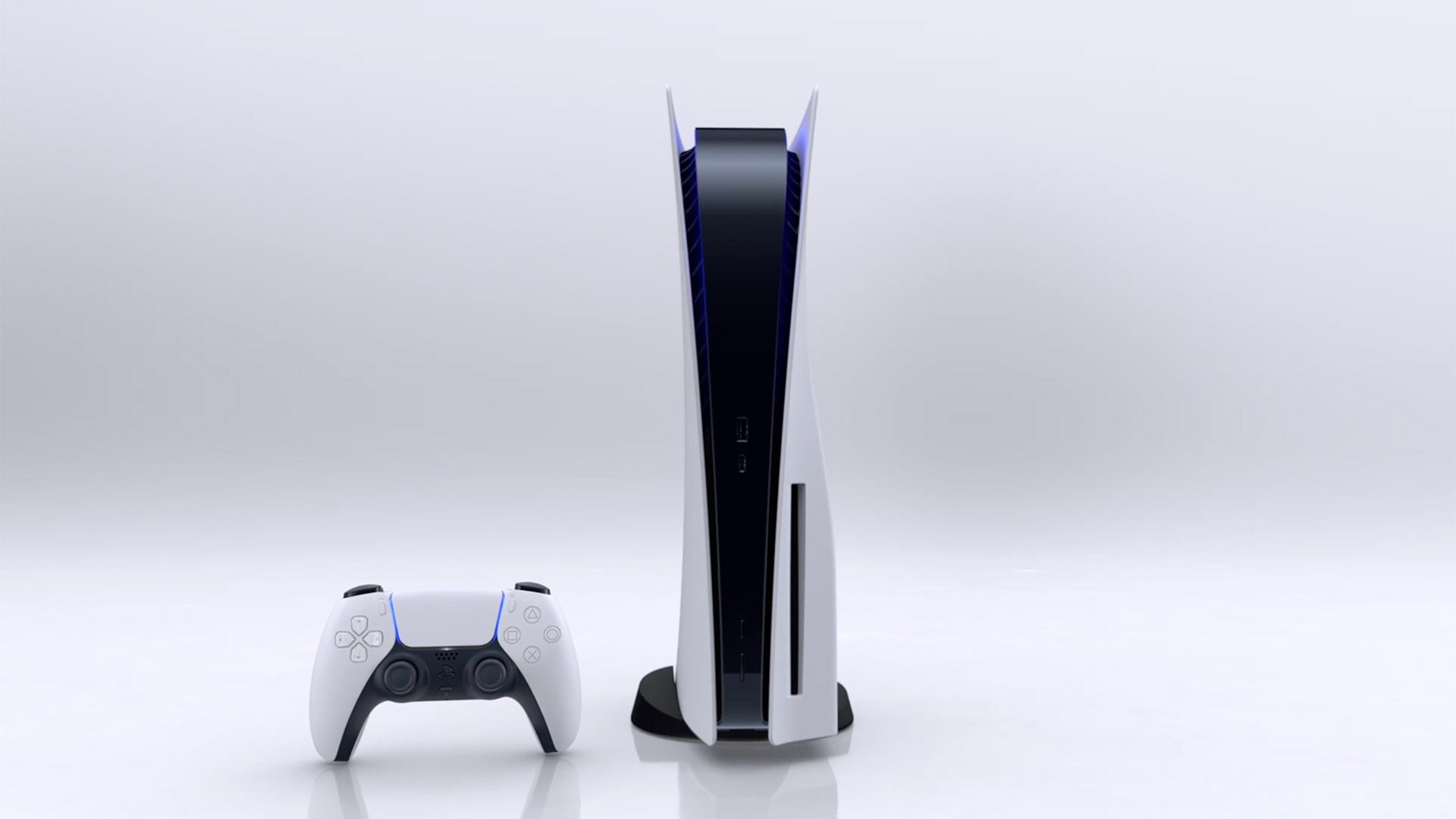
With the official launch of the PlayStation 5, the final piece of Sony’s embargo on coverage of the console has lifted—and, with it, the limit on what we can talk about. As someone deeply obsessed with the user experience (or UX) of video game consoles, I was ready to put together a big review of the PS5’s UX, both in what we should expect from a modern console, and in comparison to what Sony did on the PlayStation 4.
The problem was that, the deeper I got, the more lost in the weeds I was getting. There’s a lot to talk about here, and things were reaching a point where the important aspects I wanted to stress were getting drowned out by lengthy breakdowns of every setting or switch.
Instead, I’d like to run you through what I think are some of the stand out aspects, both positive and negative, of what Sony has created for the PS5. This will in no way be a comprehensive breakdown of everything that awaits on the console—especially given its community aspects have been difficult to test pre-launch—and I’m not sure it needs to be at this point. The experience we’re having on day one will no doubt be different than even on day 100, so we’re far from a point where we can pass full judgment. At the same time, it is important to see if what Sony’s UX team has given us is good enough for day one.
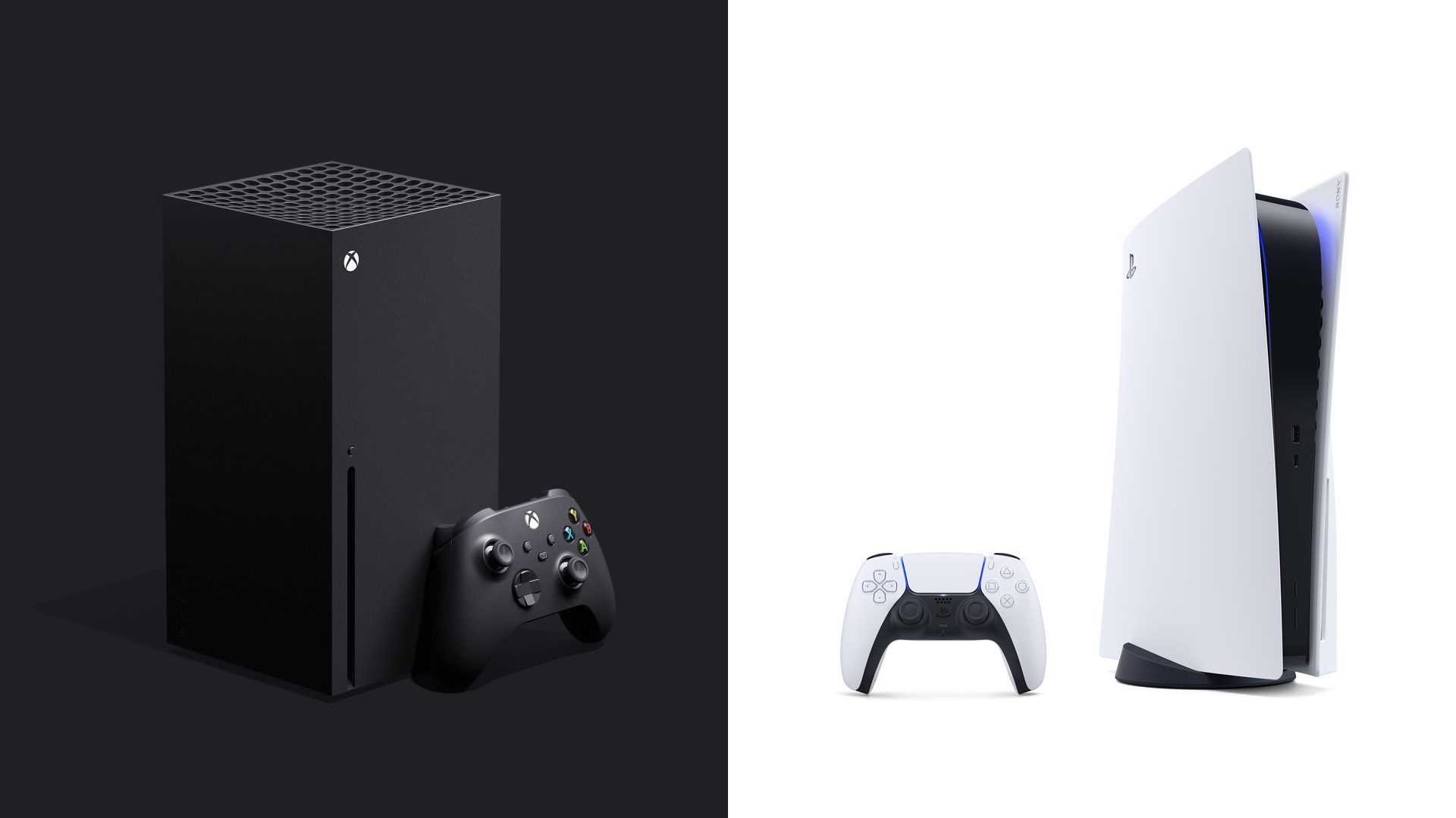
That’s an especially interesting question given the giant black-and-green elephant in the room. Unlike previous generations, Sony and Microsoft are heading down very different UX paths this time around. Sony, with the PlayStation 5, is giving us a brand new interface—well, sort of new interface—designed specifically for its new console. Microsoft, meanwhile, has moved the exact dashboard we already had on the Xbox One over to the Xbox Series X/S, an idea never tried for any console that’s had anything resembling an operating system.
There are supporters (and detractors) for both of those game plans, and I’m going to be honest: I prefer the Microsoft way this time around. Sure, the company is still struggling to find those exact refinements that’ll give its consoles a truly great user experience, and yes, it’s unquestionably boring to purchase brand new next-generation hardware only to see the same interface you’ve been using for years. However, from the very moment I powered on my Xbox Series X for the first time, I knew I was getting a dashboard that had years of polish and refinement behind it, without anything forgotten, left behind, or shelved for a later update. I wasn’t able to say the same about the PlayStation 5.
What I can now say about Sony’s latest console operating system, though, is that it’s more feature-robust than I was expecting (and fearing).
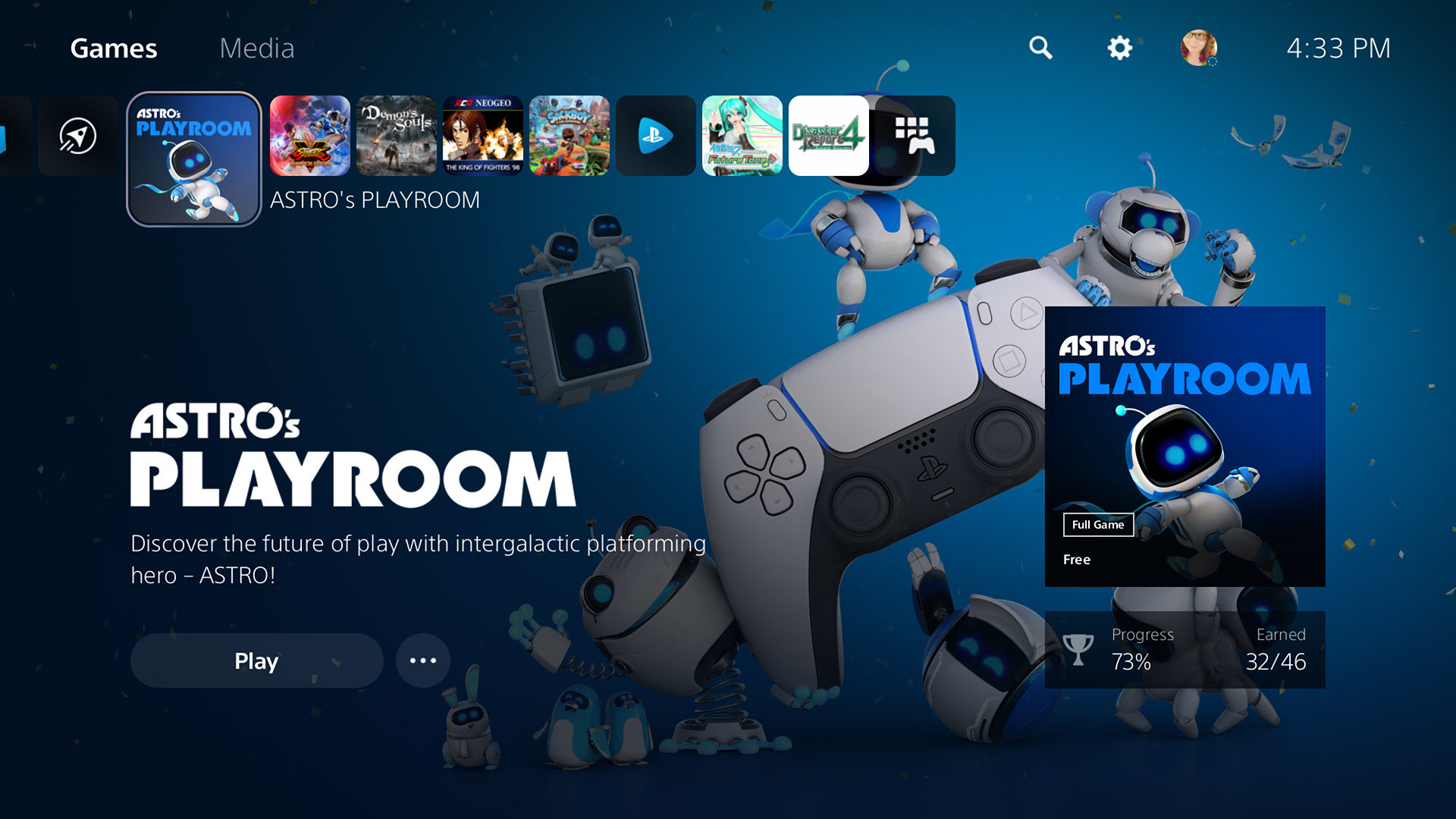
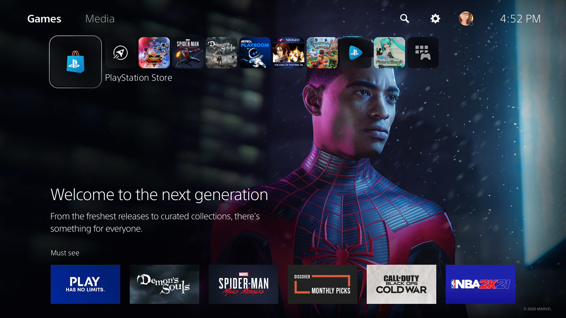
Home
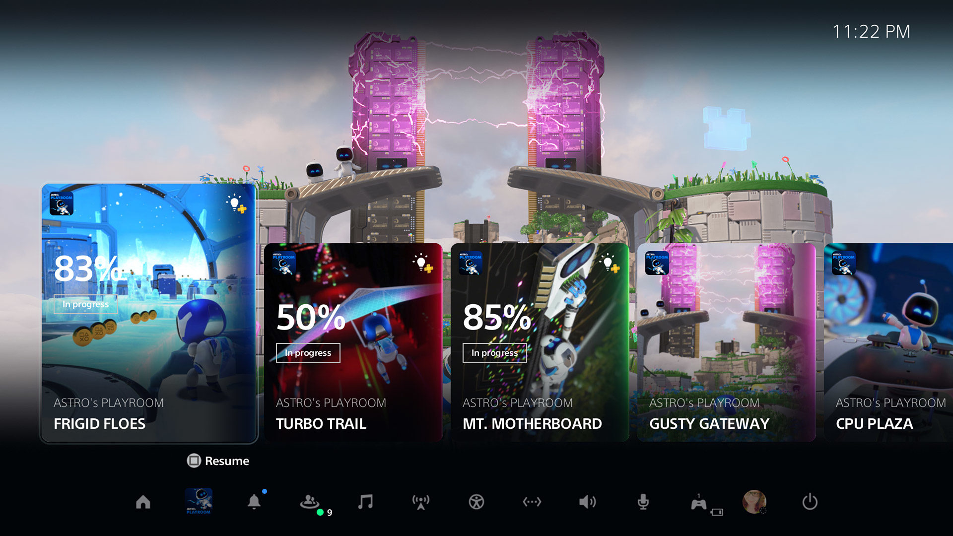
The PlayStation 5’s Home screen—which kind of isn’t its home screen, depending on how you look at it—will feel familiar yet slightly foreign to any PlayStation 4 users. On some level, I’m glad Sony didn’t go too crazy in its redesign. I honestly think the PS4’s UX is one of my favorites of any console, mixing the elegance of the PlayStation 3’s Cross Media Bar (XMB) with a nice amount of extra flash and function. In fact, there’s a lot about the PS5’s interface that seems like the direct offspring of the PS4, and I think that was a smart path to take.
However, a few of the basic changes don’t quite sit right with me. On the PS4, the bar of game, folder, and application icons took center stage. On the PS5, that bar—and its icons—are smaller, shoved up in the corner, and reduced in capacity (from 15 not-set-in-stone slots to 8). With that change, most of the screen is now taken up by background graphics and sparse user interface (UI), which looks more attractive from a visual standpoint but offers little actual benefit so far. There’s an unfortunate trend in UX these days to display bigger, splashier visuals at the expense of presenting a greater amount of choices to us users, and I’m not happy that it seems like Sony is chasing that trend.
Back on the bar, all the icons have rounded corners, which contrasts most similar elements throughout the rest of the UI. And though I cannot believe I’m saying this, there’s no option for folders of any kind at this point. We’ve been through this four times already with Sony, and yet here we are again. Folders—or some other form of organization—have been a basic function of user interfaces since the days of DOS and the Apple II, so there’s simply no excuse not to have them here from day one.
A far bigger departure from its predecessor is that the PlayStation 5 now separates its Home screen in two tabs: Games and Media. Early on, the PlayStation 4 threw media apps in amongst the games, and it was kind of a mess (but honestly not that bad). Then, Sony consolidated those apps into the TV & Video app, an awful idea that only made it an ever bigger pain to get to what you wanted.
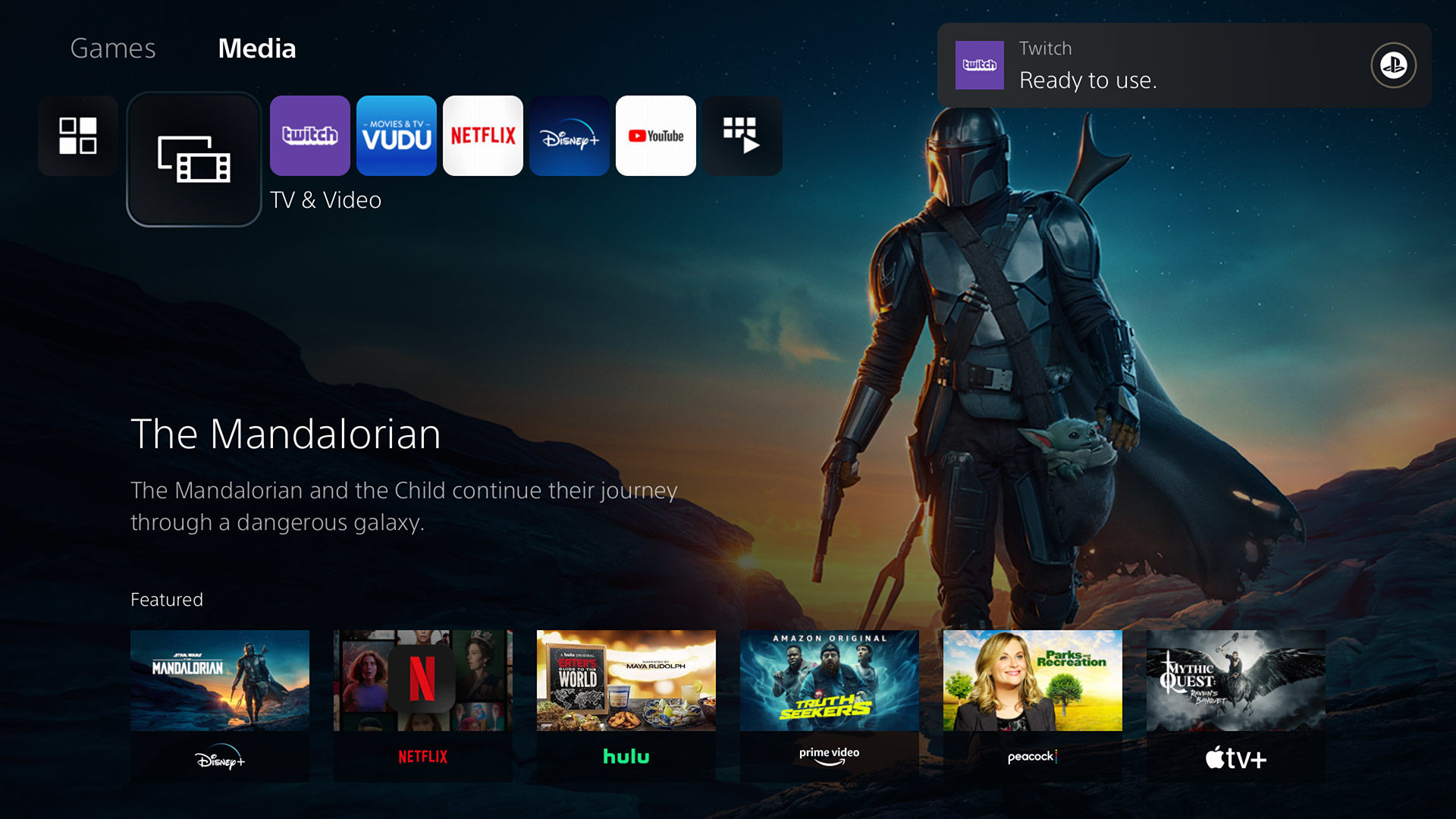
The PS5’s Media tab is sort of the TV & Video app integrated directly into the main dashboard—and that change makes the idea actually work. Now, media apps don’t get in the way of games, it’s easy to find, download, and use those apps, and Sony gets a section of the Home screen where it can promote what’s on the various streaming services like everybody else does.
One interesting (but unsurprising) new feature of the Home screen is a search option, which will search through your games and apps, the PlayStation Store, and PlayStation Network members. There are definitely times when it’s nice to have such an extensive search available, and it’s quick enough that you might find yourself using it more than you’d expect. I do wish that it would put more focus on the content you actually own and/or have installed, as your games get no real priority in the search results as they mix in with the other content Sony is offering. There’s also no way to only search your own personal library like there was on the PS4, which was a huge help when, for example, I wanted to quickly browse through all the Arcade Archives releases I’d purchased.
By far the most drastic change we find on the Home screen is the all-new PlayStation Store—but we’re not there quite yet. Instead, let’s talk about something the Home screen has lost.
Control Center
There is no bigger shift in the mentality of the PlayStation 5’s UX than the Control Center.
Whereas everything about the PlayStation 4 focused on one singular area whenever you weren’t in the middle of a game, on the PS5, there’s now two places you might find yourself. As we talked about, the first is the Home screen, where you’ll buy, sort through, and launch games and media apps. The second, the Control Center, is where you go when you’re in one of those games or media apps and you press the DualSense’s PlayStation button.
I understand what Sony’s intentions were here. I don’t know that I like the results, but I understand. I have to assume that the PS5’s UX team wanted a place that was easy to get in and out of when playing games, somewhere that would offer quick access to what you need without having to drop back to the main (Home) interface.
To that end, the Control Center works pretty well. It’s still hard to judge the new Activities section or the Cards that exist there, because for the moment, they’ve mostly been for resuming a certain predetermined section of a single-player game, or tracking the completion of Trophies. I’m far more interested to see what other uses developers will come up with for Cards, such as Epic Games’ plan to have options for instantly queueing up in specific Fortnite match types. That idea becomes especially powerful if game creators can offer us the ability to make custom Cards, so that we could link to sections of the game of our choice, track specific stats or leaderboards, quickly jump to our favorite speed runs, and so on.
The more important piece of the Control Center at the moment are the icons situated along the bottom of the screen. On the PlayStation 4, most of these functions were always waiting just above the main game and app bar, accessible by pushing up on the D-pad. Ripping them from that position and putting them here feels like a downgrade in functionality at first, but one major positive to that decision is that every function now offers a quick menu. Pick Notifications, and instead of heading off to a totally separate screen, you’ll get a pop-up panel that shows your latest notifications and offers a “Do Not Disturb” switch. Game Base provides quick access to recent parties and online friends, Network lets you make sure your internet connection is still stable, Switch lets you swap through recent games (but, to be clear, without a function like Xbox’s Quick Resume), and your personal icon offers links to your profile, trophies, online status toggles, and options for switching users or logging out.
This system can take some getting used to, because the connection between those quick menus and the fully-featured options they hint at aren’t always apparent. For example, I was initially baffled about how to find my full friends list, as I hadn’t scrolled down the Game Base popup menu far enough to find “View All Friends.” There’s a full Game Base interface, with sections for Parties, Friends, Friend Requests, and searching for other players, but the only way to see a direct, named link to that interface is by opening up the Game Base popup, hitting the Option button, then selecting “Go to Game Base” from the secondary popup.
The reliance on those quick menus versus directly taking you to different sections of the UX is one of the pieces of the PlayStation 5 that I think will turn out for the better in the long run. For now, it can be a hurdle—there’s no doubt about that. But once you’ve got a lot of your settings all set, those quick menus are probably going to do the job most of the time, and do it faster. Maybe it was a failing on my part, but I never found the PlayStation 4’s Quick Menu to be all that quick for most tasks. Meanwhile, I’ve already gotten a lot of use out of the PS5’s Control Center.
The problem for me is that there’s now some level of mental disconnection due to there being two areas to handle all the functionality that one area used to, and I still don’t feel like I can do everything I need to do without constantly switching back and forth. If I’m on the Home screen, I’ll inevitably need to hit the PS button to get to the Control Center. If I’m using the Control Center, I’ll need to check something in the Settings, which is only accessible directly from the Home screen.
Nearly all my complaints about the current set-up would vanish if Sony made one simple change: add that strip of function icons to the Home screen as well. Have them up there at the top, a D-pad push away like they were on the PlayStation 4. The PS button can still dump me to the Control Center when playing games, but that way, when I’m interacting with the console outside of gaming, I’d have access to nearly everything I need from one place. Sony doesn’t seem allergic to duplication, as the Activities section exists as both part of the vertically-scrolling content available when highlighting games on the Home screen and above the Control Center. So, embrace that duplication even further, Sony!
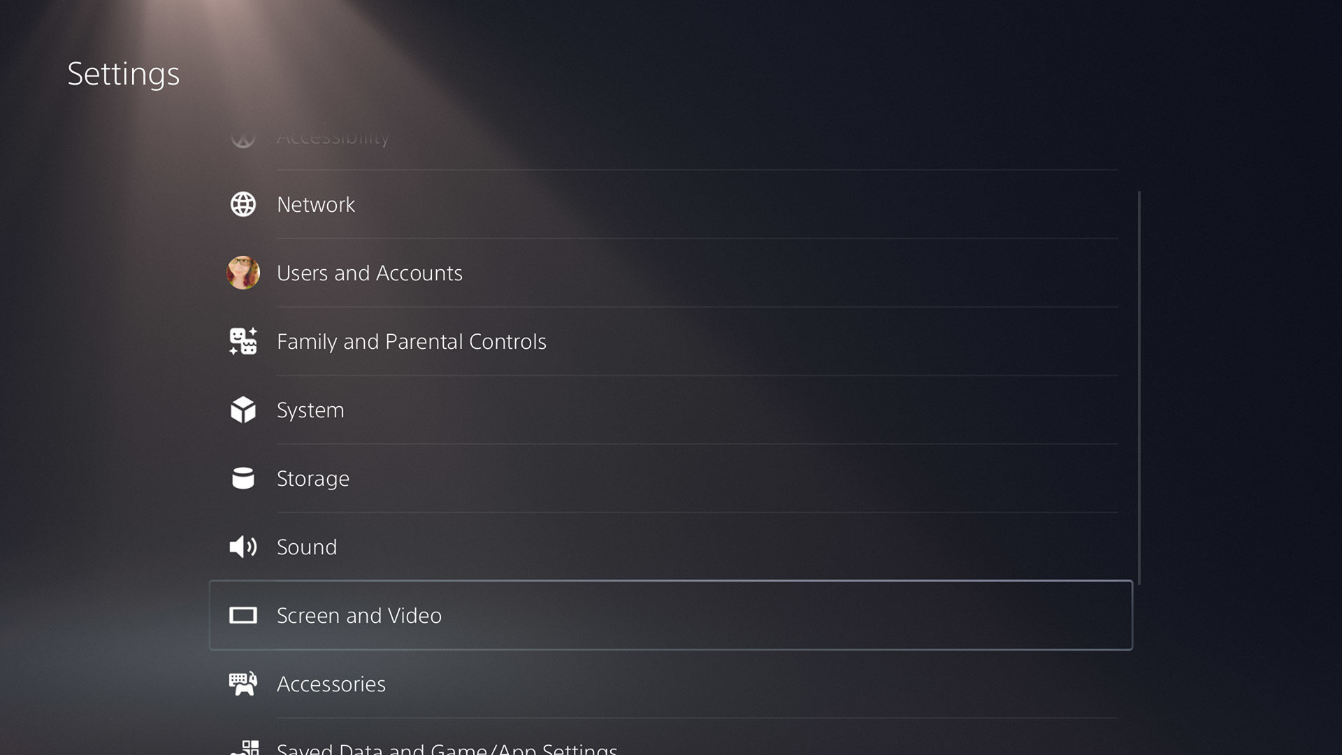
Settings
Settings is one of the more interesting sections of the PlayStation 5’s UX, because it’s here where we see the most legacy PlayStation 4 look and feel. A lot of what was available on Sony’s previous console is available here, down to the exact same options and order for those options in many cases—which is part of why I believe this is far from a “new” console operating system.
For the most part, everything here is good news. If there was a function that existed on the PlayStation 4, then it’s probably here as well, along with other refinements or additions. The overall Settings UI has undergone a nice refresh, with a lot of random menu items now combined together into more logical and encompassing categories. This is possible in part because almost every list of options is now presented in a two-column layout, making it much easier to navigate a wide variety of selections all from a single screen.
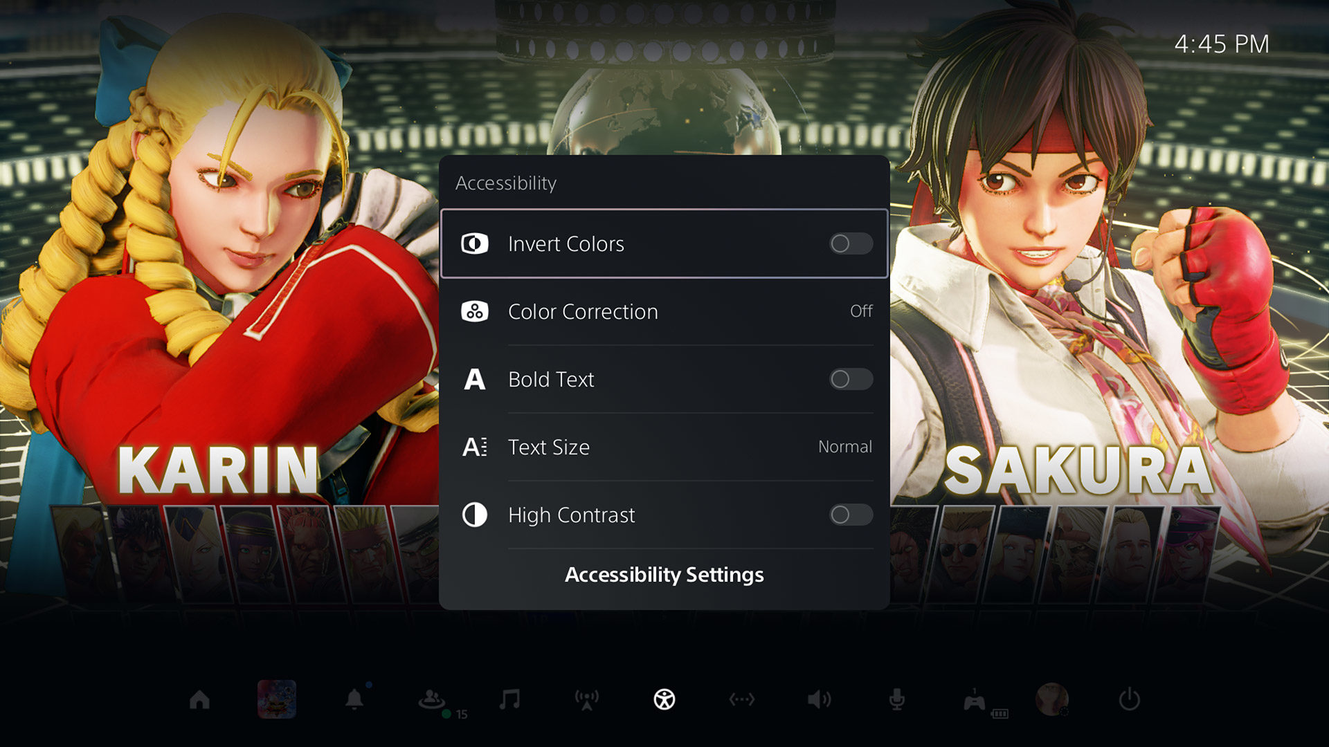
Even though they won’t affect me much personally, I have to start by commending Sony for the PS5’s much-expanded Accessibility options. In addition to everything we had before—well, except for screen zoom, which I’ve seen no sign of—users now also have access to the following:
- Color correction options to help players with color blindness, featuring choices for Red/Green (Protanopia), Green/Red (Deuteranopia), or Blue/Yellow (Tritanopia), or basic greyscale
- Four choices for system text sizes, up from the previous two
- The ability to reduce the motion in various effects and screen movements
- A new screen reader that can read the text on screen in certain situations—such as while browsing Settings—with nine speech speed options, male or female voice synthesis, and an independent voice volume slider
- The addition of the ability to swap the left and right analog sticks in custom button assignments (though, sadly, the touch pad’s two “buttons” still can’t be set)
- Options to change the intensity of controller vibration or trigger effects (between Strong, Medium, Weak, or Off for both)
- Chat transcription that can “convert the voice chat of other players in parties and games to text, and read aloud the text you enter to other players” in games that support the feature in English (US, UK), French (France, Canada), German, Japanese, Italian, and Spanish (Spain, Latin America)
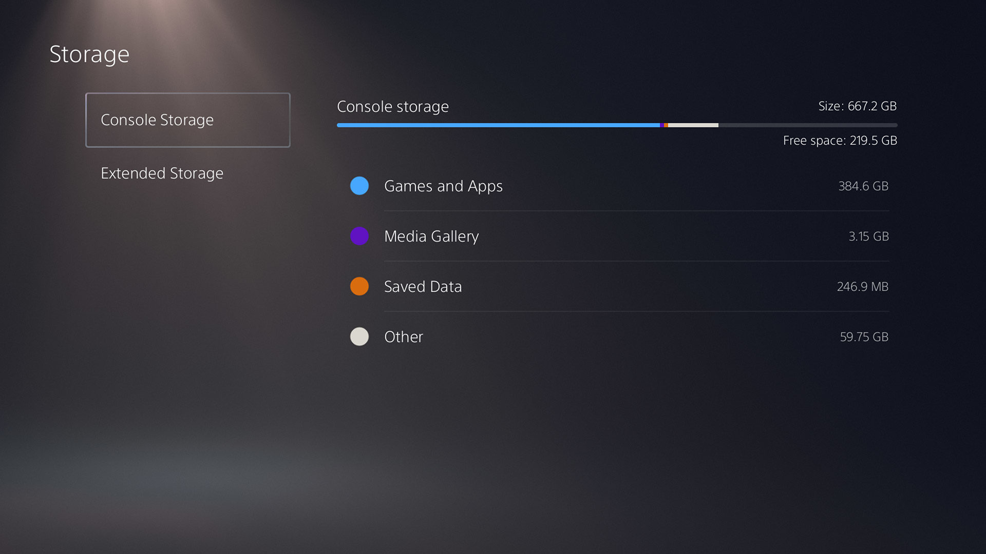
The next area worth hitting is Storage, while also wrapping in the Saved Data and Game/App Settings section, as they have some interconnection. This is where we find one of the big losses on the PlayStation 5 versus the PlayStation 4: the inability to use an external USB device for either backing up PS5 games, or for storing and transferring your PS5 save files. Sony has already said that it’s looking to allow external drives to store games you’re not currently playing in the future, but I’m not sure if it’ll budge when it comes to save files. (Both PlayStation 4 games and save work fine with external storage.)
On the positive side, dealing with both your installed games and apps, and your save files, is a far better experience than it was back on the PS4. For games and apps, the sort function is more prominent now, and you can finally select multiple items at a time. For save data, you can actually sort the list now (by game name, size, etc.)—I cannot understand how, seven years later, that simple function still doesn’t exist on the PS4. As well, selecting multiple files is much easier now, without the need to go through a multi-step process to bring up the option.
Tucked away inside Saved Data and Game/App Settings are a few very curious new additions as well. The first is Game Presets, a menu where you can tell the system how you prefer certain options to be set when playing games, and then the system can pass that information along to games so that you don’t need to make those decisions again. This actually isn’t a new concept—Microsoft tried it back on the Xbox 360—but it’s nice to see someone try again. Through this section, you can set your preferred default difficulty (from six choices), decide if you’d rather play in “performance” or “resolution” mode (depending on which you find more important, framerate or pixel count), invert the Y- or X-axis for camera movement, and set your default subtitle and audio languages.
What’s exciting about Game Presets is the hope that they might allow developers to integrate those choices into games where there might not have been options to do so otherwise. To be fair, there are almost no titles at this point that don’t let you invert the Y-axis, but they do still sometimes exist. If this makes it so that a dev has no excuses anymore, it’ll all have been worth it. My concern, though, is how widespread these preference hooks will be. Unless Sony is requiring support for Game Presets in every approved PS5 title—and I’d love to see them do so—some of the bigger studios simply might not care, instead pushing players into their own per-game options screens.
The other intriguing thing here is the Spoiler Warnings section, which unfortunately I don’t have any real working knowledge of yet. We received a hint from Sony previously that PS5 users would be able to block content that would contain spoilers, and here in the options, you can either block “only spoilers identified by game developers” or “everything you haven’t seen yet.” How extensive is this spoiler blocking going to be, and how many developers will implement it? I’m curious to find out the answers to both.
Beyond that, let me hit on a few other quick yet notable options in Settings before we get onto a final big rant. Both the ability to log in via facial recognition, and navigate certain menu options via voice commands, are gone. Not surprising, really, as I doubt either saw much use on the PS4—yet it’s funny that Sony removed the latter while simultaneously giving every PS5 controller a built-in mic. You can now save recorded gameplay clips as either MP4 or WebM, with the choices of clip length seeing a few changes (15 seconds added, 1 and 10 minutes removed). You can now manually input more exact speaker positions for your home setup, but you cannot, unfortunately, operate the console at 1440p—a huge frustration for those who prefer monitors instead of HDTVs. When using a PS5 controller plugged in by USB cable, you can now actually set whether the console interacts with it either via Bluetooth or the cable. This may seem like a small thing, but it could end up being a big deal for anyone who prefers the extra precision of using wired controllers. Plus, it may help reduce potential crosstalk when playing in locations with other consoles in close proximity, such as at tournaments.
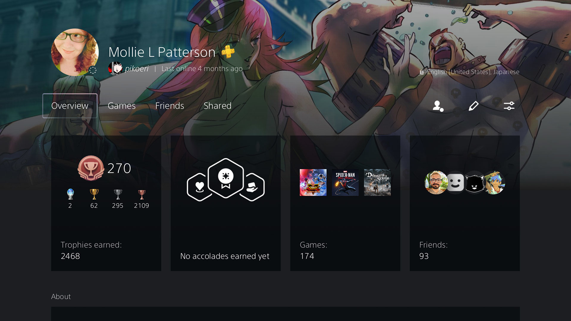
But—that all takes us to Profiles, and this is where I have to vent. Sony has done almost nothing in terms of expanding or enhancing user profiles, as the same basic fields and same text limitations (such as 140 characters for your “About” section) remain in place. Disappointing, but maybe not a huge deal. What is a huge deal—at least to me, and some others—is that the company has done nothing to update its ancient Online ID system. When Sony originally set up PlayStation Network accounts, it seems they had all of a user’s data tied directly to their Online ID, instead of a unique number or some other identifier. This meant that, for years, across both the PlayStation 3 and PlayStation 4, users had no option for changing their nickname. When the option was finally presented last year, it came with the caveat that it could cause technical issues with digital purchases or playing games online, and that child accounts couldn’t undergo name changes period.
I know people who have had problems crop up after changing their Online ID, and as much as I really want to change mine, I don’t dare do so, as I’ve got 13 years or purchases across five platforms (PS3, PSP, PS4, Vita, PS5) attached to that account. Sony is the only major console developer at this point that has an issue with this. On Xbox, it’s a 30-second process with no side effects. On the Switch—and from Nintendo of all companies—I can change my display name on a daily basis if I want. With the launch of the PlayStation 5, Sony had the perfect opportunity to add a similar “display name” field to user accounts that every game would support. But Sony didn’t do that, and it’s frustrating.
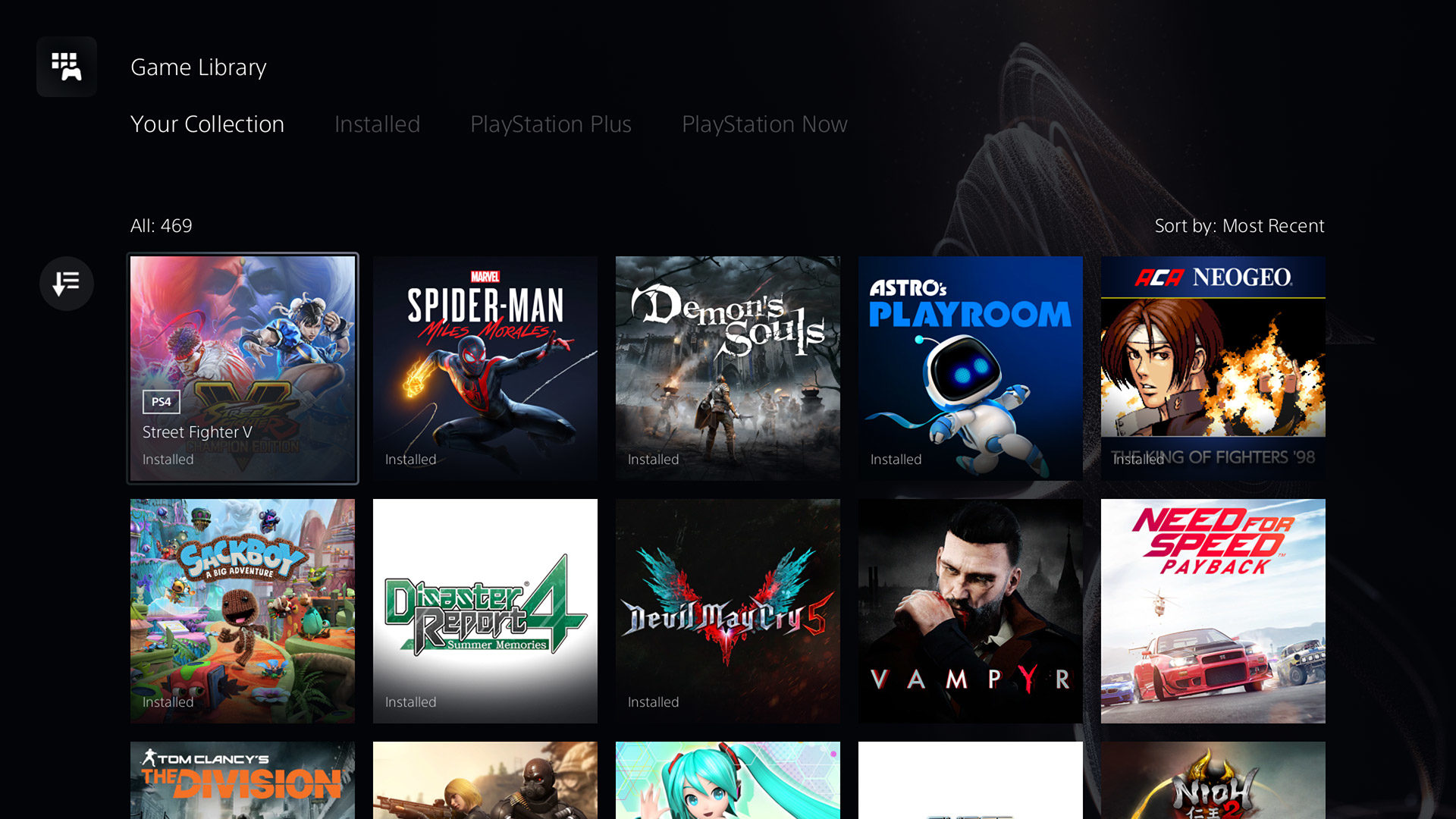
Game Library
The next place of importance in the PlayStation 5’s UX is the Game Library, and if you’ve used a PlayStation 4 at any point, it’ll feel mostly familiar, with the biggest change being how you filter what you see. Now, across the top, you’re presented with four options—Your Collection, Installed, PlayStation Plus, and PlayStation Now—and you can refine each of those sections further. For example, when looking at Your Collection, you can then sort the list (by most recent, purchase date ascending/descending, or alphabetically ascending/descending), filter by platform (PS5, PS4, or PS3*), and/or filter by source (PS Store, PS Plus, PS Now, Other).
Overall, the combination of those tabs and the filters makes for more powerful browsing, especially as you’re able to combine multiple choices together—but I do wish that Sony would expand those filter options. Give us options like publisher, developer, genre, and sorting by install date, and I’d be ecstatic. I do also have to point out again that the Game Library–specific search option is now gone, which is a shame for those of us with larger libraries.
* Don’t get too excited—that’s just for filtering PlayStation 3 games from PlayStation Now, and not a hint that the console can natively play PS3 games.
PlayStation Store
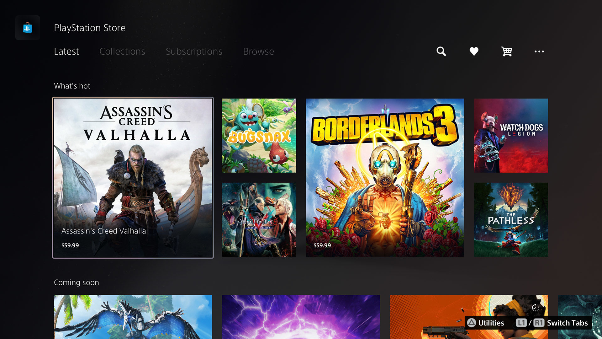
The final piece of the PlayStation 5 I want to discuss is the PlayStation Store, and I’m going to be honest here: It’s kind of unnerving at first.
Sony talked about how it wanted to integrate its digital storefront more directly into the PlayStation 5’s user experience, but I didn’t realize that meant it would be right there on the Home screen. Like, literally, you move over to the Store’s icon, and everything is just there. Navigating down takes you through “must see” games, what’s popular, games that are coming soon or featured, DLC for titles you own, and then links to full pages for PS5, PS4, Free to Play, and VR games. After the slow mess that is the PlayStation 4’s current digital store, this is almost too fast and easy to navigate. It’s confusing. It’s scary. I keep thinking that this shouldn’t be the actual new PlayStation Store, but it is.
I do worry that all that speed, ease of use, and integration will come with a cost, though. Even without years of PlayStation 5 titles added to it yet, the store can feel overwhelming when you’re trying to look for specific things. As over-complicated as the PS4’s store may be, those tabs, categories, and sections help to segment what you’re looking for in different ways. Here, it can feel like you’re given a huge pile of games, and told to dig around for what you want. You do get the ability to filter results here as well, and unlike the personal Game Library, you get some extra options, such as genre, age rating, and if the game supports VR or not. (While you’re adding developer and publisher options to the Game Library, Sony, add them here as well.)
The new PlayStation Store is something that’s simply going to take time and usage before any of us can get a real grip on if it’ll end up being a good or bad idea in the long run. This is easily the most dramatic shift Sony has taken with how we interact with our consoles, and I respect the team for taking such a big swing. Whether that swing connects or whiffs, though, I’m not ready to call just yet.
Oh, and for all of you out there wondering: Yes, Wishlists are back.
A (Sorta) New Beginning
The user experience that Sony has put together for the PlayStation 5 is one that’s new, yet old. Daring, yet safe. Fresh, yet familiar. If the console itself is a dramatic break from the PlayStation 4 in power and potential, its interface is more evolution than revolution. And, honestly, that’s probably a good thing. There were huge parts of the PS4’s UX that weren’t broken, and I’m glad Sony sought to polish or expand those parts instead of trying to recreate them from scratch.
At the same time, there are also places where it feels like Sony was too conservative at best, or unambitious at worst. When I look at the dramatic work that’s gone into the PlayStation Store, or the whole concept of the Control Center, I think about what we could have gotten had Sony shown that same love to other portions of the UX as well.
Here on day one of the PlayStation 5’s release, the interface and options Sony has given the console feel like they’re in a good place. It’s updated, it’s in 4K—unlike over on Xbox—and most of the features you’ll want are probably here. The console has many years of life ahead of it, and there’s no doubt Sony will build and improve on what currently exists to make for an even better user experience. It’s just a shame that we may once again find ourselves waiting years to get some of the more basic quality of life improvements that we could, and should, have already had.