


Like clockwork, Microsoft announces changes coming to the Xbox’s user interface
Benjamin Franklin once said, “in this world, nothing is certain except death and taxes.” Unfortunately, Mr. Franklin couldn’t see into the future, or he would have included another inevitability: Microsoft making changes to the user interface on an Xbox platform.
After many attempts to get the dashboard right on the Xbox One, I think the current version that we have now on that platform and the Xbox Series X/S isn’t all that bad. (At least, UI-wise—don’t get me started on the crummy Game DVR.) Microsoft seems to disagree, however, as the company today announced that a new home screen is coming to its current-gen consoles next year—or sooner, if you’re a member of the Xbox Insiders Alpha Skip-Ahead ring.
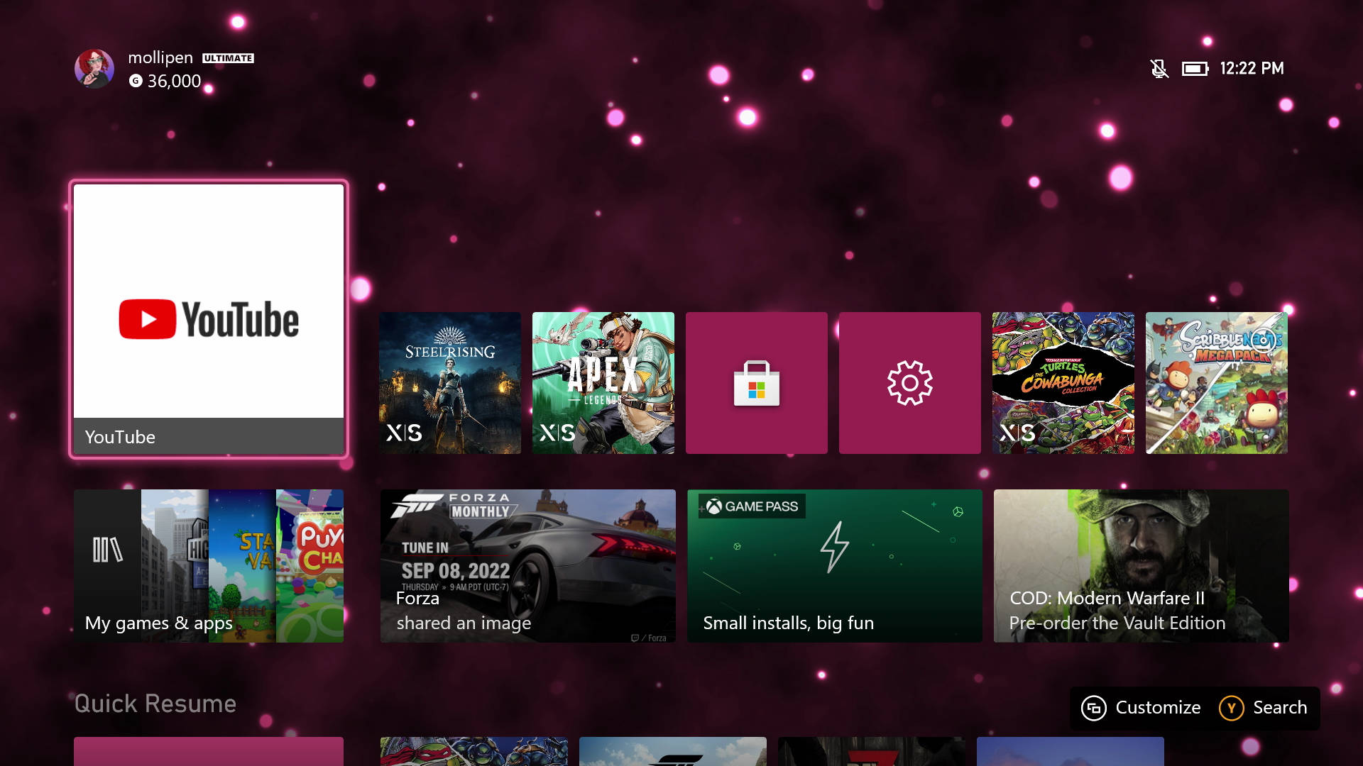
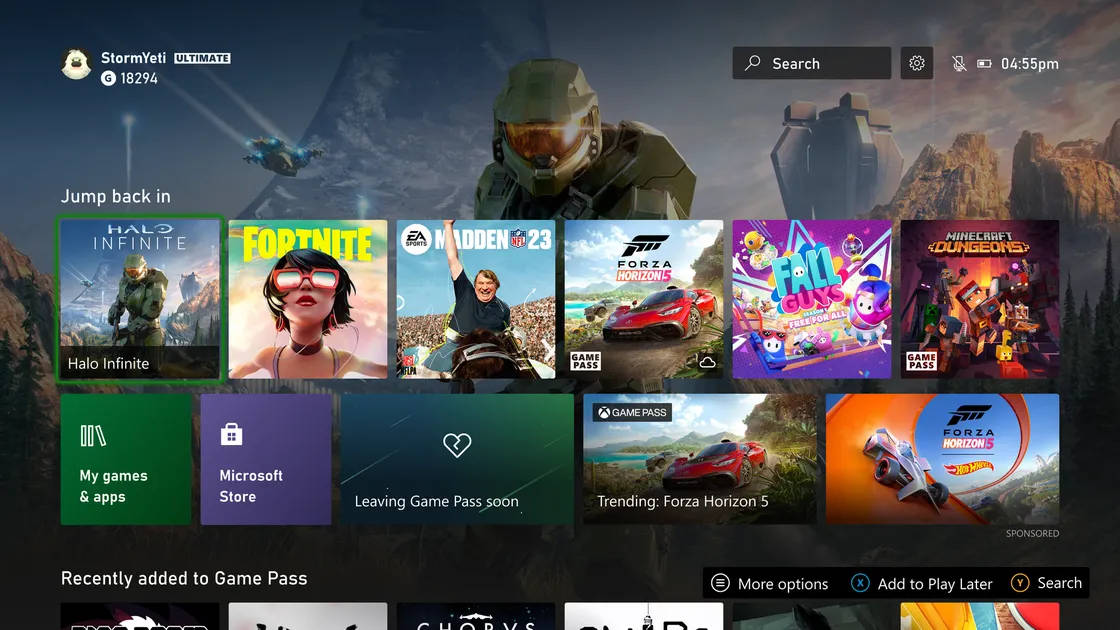
Before we get into any details, here’s a look at how the Xbox home screen looks today, and how current plans have it looking next year (pending feedback):
According to Ivy Krislov, senior product manager lead of Xbox Experiences, the team’s goal is to kick off “a multi-month series of experiments to learn how to create a more personalized home screen experience and address some of the top trends and fan requests.”
Krislov goes on to run down the “key updates” for the first round of previews:
• The new “Jump back in” row gives you quick access to your most recently played games and apps.
• Easily access important system apps like Settings, Store, Search and My Games & Apps with their own dedicated tiles on Xbox Home.
• Consistent design and visual identifiers with updated layouts to keep the experience familiar.
• When you scroll down, you’ll see curated categories and recommendations tailored to your gaming preferences.
On a personal level, I think I like things more the way they are now than they are in the screenshot above. I prefer the current active game being presented more prominently, and now, we get that plus six recent games, where as on the new home screen we only get six games in that row period. The addition of a quick link to the Microsoft Store is a benefit, but I’ve never found it a hassle to just scroll down a few screens to go to it currently. Having the gear for the system settings exist prominently on the home screen is nice I guess, but why are there two instances of search: one as a bar you have to go to at the top, and one as a button label at the bottom?
If we’re talking about updates that I really want to see, how about letting me set certain apps or games so that they don’t show up in my recents row? As you can see in my screenshot, I’ve got both the store and system settings there, which I don’t want. It might also be nice to make that recents row pins instead of games/apps that swap in and our, as pins would probably be more valuable to me. Or, even better, a mix, with like three pins, and three recents.
Anyway, it seems Microsoft is looking to take feedback on all of this, so who knows what we’ll get for sure when this launches in a future dashboard update next year. If only I was in the Alpha ring and could participate, instead of being stuck as a lowely Beta.
Source: Xbox Wire

Mollie got her start in games media via the crazy world of gaming fanzines, and now works at EGM with the goal of covering all of the weird Japanese and niche releases that nobody else on staff cares about. She’s active in the gaming community on a personal level, and an outspoken voice on topics such as equality in gaming, consumer rights, and good UI. Check her out on Twitter and Mastodon.